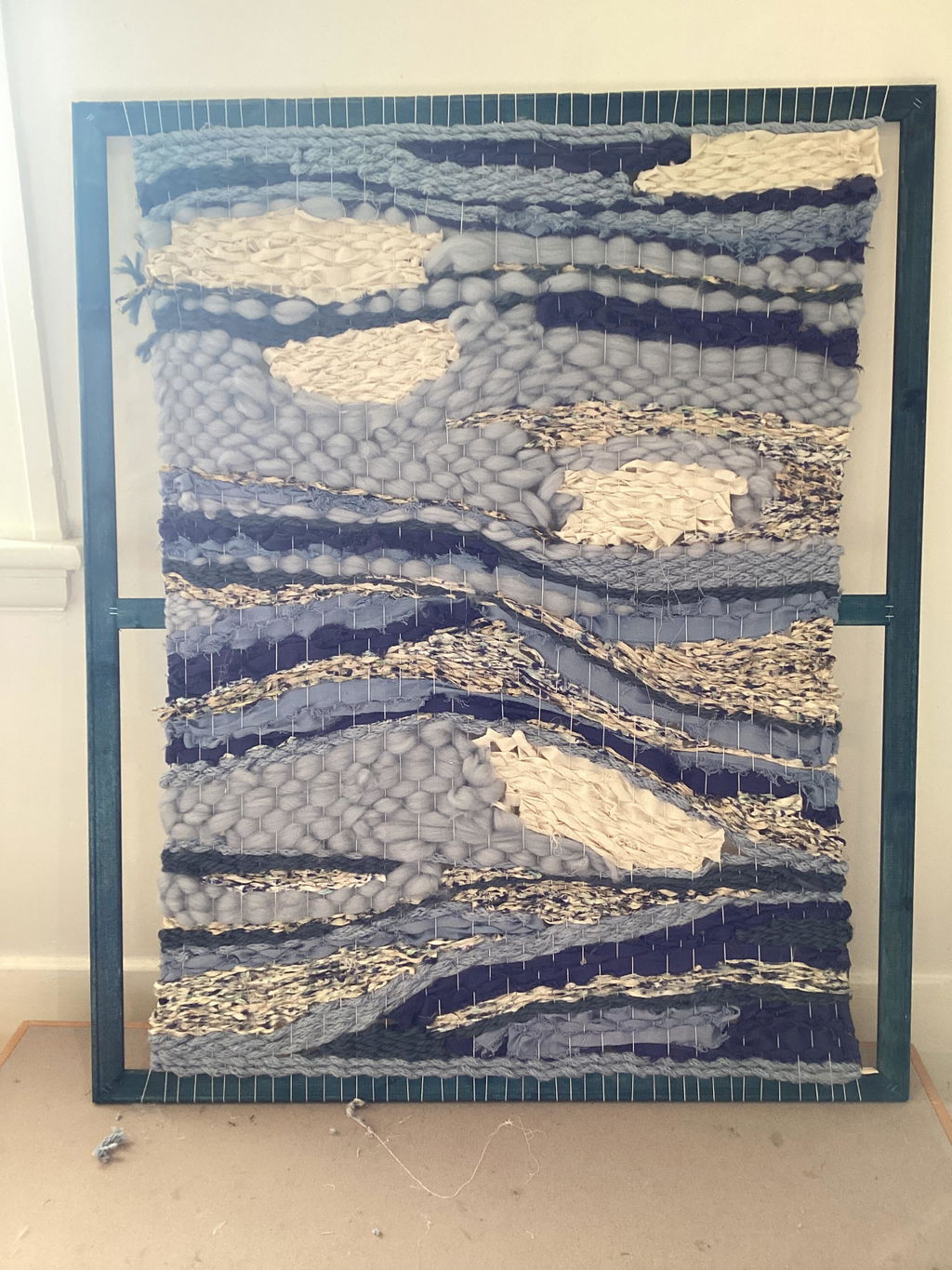
We Made Too Much || SHOP Our Best Sellers ON SALE Today

Country

  • Log in
  • Cart (0)
  • Checkout
macrame cotton cord rope workshops
  • Sale
  • New
  • Bundles
  • Kits & DIY 
    • DIY Kits
    • Fibre Kits
    • Patterns
    • Pendant Lighting
  • Macrame 
    • Recycled String
    • Recycled Rope
    • Cloud 9 Premium Macrame Cord
    • Confetti Macrame String
    • Mixed Macrame String
    • Natural Cord
    • Hand Painted String
    • Metallic String & Rope
    • XXL Thick Rope
    • Luxe String
    • Braided Sash Cord
    • Jute
  • Weaving 
    • Looms
    • Speciality Fibres
    • Tools
    • Warp
  • Pendants
  • Shop by Fibre 
    • Cotton 
      • Braided Rope
      • Ribbons
      • String
      • Twisted Rope
    • Silk
    • Merino
    • Linen
    • Chiffon
    • Metallic
    • Paper
    • Hemp
    • Jute
    • Velvet
  • Tools 
    • Beads & Rings
    • Brushes & Combs
    • Crochet Tools
    • Hoops
    • Knitting Tools
    • Macrame Pin Boards
    • Needles
    • Scissors
  • Gift Cards
  • Subscribe 
    • Blog
  • Country

The Handmade Artist Blog

A Deeper Understanding of Colour

September 04, 2021 0 Comments

mary_maker_studio_colour_queen_macrame_supplies_buy_online

(a bevy of beautiful blue macrame cotton strings pictured above. These and many more available at www.marymakerstudio.com.au)

Did you know that we decide if we like or dislike something within 90 seconds? And the first process of elimination is based on colour! It is important to not only understand the value of colour, but how you can use it in your Art. So let's get started!
Initially, when we think of the colour we may be transported back to year 7 art class... sitting on those uncomfortable wooden stools trying our best to ignore the hippie art teacher who smelt of incense. I know... i was that teacher!
Instead.. let us discuss the power colour holds. How you can use it to attract and entice customers, to create magnetism and a significant sensory experience within your fibre work. 

Colour influences us in a myriad of ways, we have both physical to psychological responses to colour. Gaining confidence in how to use colour effectively *and to your advantage* will quickly become a superpower as a Fibre Artist! Colour influences our mood, lifestyle and buying habits, so it is important to consider the message you wish to convey when curating colours for your next fibre collection. Combining colours with little knowledge of the effects of colour can often feel overwhelming. Thankfully there are some *rules and tools* focusing on colour curation to help you get started.
Let us have a look…

macrame_cotton_supplies_buy_online       buy_macrame_string_online_diy_craft
Above image showcasing complimentary colours within a multitude of textures working magically together. These fibres and many more available here
      
complimentary_colour_art_therapy

Complementary colours sit opposite each other on the colour wheel and are made up of one primary and one secondary colour (red & green, blue & orange, yellow & purple). When placed next to each other they make a bold statement. At first glance this colour combination can seem quite daunting to work with, but with confidence this is a fantastic combination to explore as the inclusion of both tones creates a sensory experience that no other combination can manifest.
The science behind this is, our eyes play a beautiful balancing game when viewing colour. When opposite colours are viewed in unison, they stimulate both the low frequency and high frequency cones within our eyes. Put simply… inside our mind they seek our equal attention. As they both hold such powerful (yet opposite) frequencies, when viewed together they try and outdo each other… yet their intensities balance each other out and they become best friends.

These colours are often used in brand logos, sporting teams and anyone who wants to create a lasting impression. Let us also remember that yellow doesn’t just mean banana yellow, nor does orange mean orange. Our eyes are magical things and view colours within a broad spectrum so yellow can include everything from vanilla, gold, mustard and everything in between. Orange can encompass everything in its surrounds including honey, terracotta to bronze! Explore complimentary colour, its complexities and have fun choosing your favourite tones. When collating you next fibre purchase have a little look at the colour wheel, see what tones fit the aesthetic you are looking to convey and be brave.. choose a colour that compliments. Whilst colours like blue & orange may not initially seem to be friends..they are. It's science. Choose a tone of each that you are drawn to and watch your work pop!

split_complimentary_colours


Split-complementary colours can be easier to balance than complementary colours. Split-complementary colours consist of three colours; a dominant base colour and two adjacent colours to the base colours complementary colour on the colour wheel.

By using a split-complementary colour you can still create contrast and interest in your work but it takes out the vibrant struggle complementary colours can have, splitting our minds eye to a greater mix of the spectrum.

        
Images analogous colours within used with Macrame pieces working like magic. These fibres and many more available here


artist_colour_wheel

Analogous colours are those that lie next to each other on the colour wheel. Fundamentally, they create harmonious and soothing colour palettes as they reflect similar light waves. They include a dominant colour and others that compliment, rather than detract. They are ever present in nature, and within our fibre creations. Holding the ability to create a sense of peace and familiarity, they are incredibly favoured by human eye.

Analogous colours when paired together can lack contrast, however as Artists we can use this to our advantage. This enables fibres too flawlessly blend to create a soft aesthetic and ultimately it allows our complimentary colours to dramatically POP when added near-by.
Whereas complimentary colours make me think of Beyonce and Kanye both on stage vying for our undivided attention, Analogous colours would be better represented by Beyonce and her back-up singers! Both perfect collaborations... but bringing a different energy! 


Triadic colours are evenly spaced from around the colour wheel, typically forming a triangle or rectangle. They are often contain vibrant colours but tend not to create the same bold effect as when using complementary colours. When using within your creations it best to follow the same principles as when working with split-complementary colours, choosing one dominant base colour and accents to suit. Play around with different tints and shades of colours to create different moods for your work.

learn_the_colour_wheel_in_art

So now that we have a greater understanding of colour, let's have a look at how we can use its magical properties in our Fibre Art.

Colour Temperature: Warm & Cool Colours
The colour wheel naturally splits into warm and cool colours. Placing warm with cool can create a strong contrast whereas placing warm with warm creates a more calming and harmonious effect. Prior to commencing your work is it best to decide how you want the end piece to feel. Warm colours generally symbolise happiness, optimism, energy and excitement.. along with heightened emotions such as joy. Cool colours are typically associated with calm and soothing environments, the feeling of peace, rest and contentment. 
Before we start to think that blue is cool and red is warm.. which is sort of correct. Now we learn that each colour has an underlying warm and cool tone within. Confusing i know! When choosing colours to fill your fibre stash its recommended to use cool colours together and warm colours together to create a sense of flow and ease. If you wish to add a spot of interest, throw in a pop of the opposite (eg primarily cool piece with a pop of warm) to bring the drama. This acts in the same manner as a contrasting colour within an analogous curation. 
In art class, if we wanted to create brown paint we would mix complimentary colours together, one warm and one cool (eg warm blue & cool orange) Adding white or black to perfect is depth, this was a fast way to create brown (many did this by accident too hehe) Obviously in our artworks, the fibres do not melt into each other so a brown does not appear, but a striking contrast demanding our attention does. Let us use this knowledge to our advantage! 
warm_cool_colours

When choosing colours from our wide range of supplies, choose colours that compliment and contrast depending on your desired aesthetic. When I am deciding on colours for a tapestry weaving I always make sure I not only mix up the textures with silks, art yarn & cotton string, but i choose analogous colours with a pop of complimentary in there to create a striking effect. Love the drama!

Light and Colour
The combination of, well it's a beautiful dance when used in unison.
Every colour we see is a byproduct of the spectrum of light. How much an object reflects or absorbs light will dictate its depth and the way our minds eye views it. Natural light differs greatly depending on the weather, time of day/year and the suns ever-changing position in the sun. Morning light will create a filtered view as cool colours seem to glow warmer, alternatively colours viewed at night appear deeper with less contrast. Understanding these factors can help you to anticipate how natural light will affect colours. So, when looking at colours in different types of light and on different surfaces they will appear different.
If we popped a roll of rope on a stool in the middle of the room, gathered our friends to stand around it on the hour every hour, every hour throughout the week... yep, we would all view it differently every - single - time.
Ever thought your walls changed colour.. they did!
Colours are complex, interlaced and incredibly subjective. Their placement within your artwork will create varying effects, moods, and results. Be conscious of what you use, how and why. 

colour_temperature_learn_online


Colour and Emotion
Colours conjure up an array of feeling for us, whether it’s a memory, a feeling, or a brand. They have a powerful influence over our behaviour and can impact how a viewer sees and experiences your work.
Red: Passion, love, anger, hunger, sensitivity, and courage
Orange: Vitality, creativity, enthusiasm, freedom, and activity
Yellow: Optimism, energy, joy, light, and hope
Green: Health, renewal, growth, nature, and wealth
Blue: Trust, wisdom, loyalty, security, intuition, and spirituality
Purple: Creativity, grandeur, peace, pride, royalty, and wealth

Many brands invest heavily into research surrounding colour psychology and how best it can benefit their business. Do they need to make people hungry, or sleepy, or angry to help sell their products? Take time to research and understand the messages and images you want to convey with your designs and branding to help create recognition and a loyal following. Have a look at the three logos below, all with striking use of complimentary colours, variety of colour temperature and colour symbolism.. accident? I don't think so. 
Let us create a brand, artwork and feeling that has impact.. and lasts.

colour_theory_complimentary_colourscolour_theory_but_macrame_supplies 
Piecing all of this together may take a little bit of time, but i p-r-o-m-i-s-e the confidence and pride you will find when curating your next piece will be worth it... and then some! Popular colours may change with the seasons, but colour principles remain the same. When an 'on trend' fibre colour enters your world you will know exactly what to pair it with.. what will make it pop and how to include items from your current collection with it. 

I may sound like a dork.. but i am so ridiculously excited to see this knowledge within your work. 
So now... it's time to explore, experiment and have FUN.
Lay your supplies out on the floor, play around, create your favourite combinations and gain confidence in colour!
I hope this help, please let me know xx
Big love, today and every day.
Brydie
#queencolourlover

mary_maker_studio_brydie_stewart_colour_queen


Tweet Share Pin It Email

Also in The Handmade Artist Blog

Free DIY Layered Macrame Wallhanging Pattern

October 06, 2022 0 Comments

Free DIY Beginners Macrame Wall hanging. Hello and Welcome. I have created a free boho macrame wall hanging pattern for you to get your creative juices flowing. This pattern requires only a few macrame knots, it is easy follow and even easier to appropriate into an original design of your own.

Continue Reading

Hobby & Heart. How to successfully monetise your craft, from someone who has.

May 02, 2022 0 Comments

Being creative is apart of who I am, and if you're reading this... its who you are. It’s how I self-express and share my journey. It was only 3 years ago when I 'found' macrame as someone in my life sharply told me to 'get a hobby'. Before this, I didn’t know what macramé was or or how to even pronounce it...

Continue Reading

Weaving: The History and Rise of the Worlds Oldest Craft

March 21, 2022 0 Comments

You cannot go into a home decor shop without seeing a delicious fibre creation that you simply ‘must have’ in your home. They are not only beautiful to view, but to create and with the popularity of DIY courses, many people are finding it easier than ever to learn how to weave... let me show you how.

Continue Reading

  • About
  • Affiliates
  • Blog
  • Contact
  • FAQ
  • Privacy
  • Search
  • Terms of Service
  • Refunds
  • Rewards
  • Wholesale


© 2025 Mary Maker Studio - Macrame & Weaving Supplies and Education..

Apple Pay Google Pay Mastercard PayPal Shop Pay Union Pay Visa
★ Reviews

Let customers speak for us

2785 reviews
Write a review
99%
(2754)
1%
(29)
0%
(0)
0%
(0)
0%
(2)
J
Cotton Frizz Rolls
J.C.B.

Very happy with the product, came quickly

S
Your Secret Offer
Suzanne B
Great Quality Cord

Everything I have ever bought from Mary Maker studio has been perfect. Great cords, great colours and fast delivery! The macrame cord is so soft and buttery it’s a pleasure to work with

J
Natural Macrame Cotton String // 3mm
Judy C
Great cotton string

I’ve just started on a new project with this string and so far going well! After using 5mm it’s so different with 3mm! Stays together really well and easy to tie. I’m a loose knotter but this seems to tie well.

User picture
M
Hand Painted Macrame String // Fire & Ice
Michelle McDougall
Fire & Ice

Such beautiful colours & so soft to work with. Love it!!!

123